In
this tutorial you'll learn how to create an advertisement poster for
your personal shoes. When working on an advertisement you must pay
attention to all the details as you publish your poster and prepare it
for the whole world to see. Another important thing about advertisements
is that you need to work hard on all the details and do everything you
can to make the product look better and as attractive as possible.
The rest of the concepts you create for the poster will just attract more eyes, but if your product does not look great, and if it is not the focal point of the composition then you may fail, the possible customers will just turn around and look at the next poster. Let's get started!


For this step, the Pen Tool (P) will help you cut out what you do not need. Also, the Burn Tool (O) will help you add shadows and a lot of masking.


The rest of the concepts you create for the poster will just attract more eyes, but if your product does not look great, and if it is not the focal point of the composition then you may fail, the possible customers will just turn around and look at the next poster. Let's get started!
Final Image Preview
Take a look at the image we'll be creating. You can view the final image preview below or view a larger version here.Preparation
Before getting started take a look at the images we'll be using: Vector Pedestal, Floral Elements, Vector Pattern, Pedestal, Vintage Wall, Shoe.Step 1
First of all create a new document. If your intention is to print this poster at a large size, you might want to consider creating the document using a large size and 300 dpi. Fill the background with #6a360f.
Step 2
Create a new layer on top of the background and fill it with black, then go to Filter > Render > Clouds (make sure your foreground and background are black and white). Then set the layer to Soft Light and Opacity to 50%.
Step 3
Import one of the vintage textures into your document. As you will see, the image is not big enough. You need to duplicate it and place it below the first one so that you create a bigger texture. Merge the two layers and set it to Multiply and Opacity at 70%.


Step 4
Next, create a new layer. Then use the Gradient Tool (G) set to radial and black to create a gradient.

Step 5
Import the Vector Pattern from deviantART. You will also have to rebuild the pattern to make it bigger (duplicate it a few times then put each piece together). In the end set the layer to Soft Light and Opacity to 10%.

Step 6
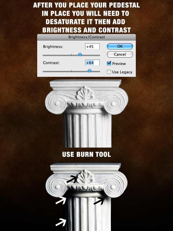
Open the Pedestal image and select one from those two images. Use the Pen Tool (P) to select the pedestal and cut it. Move the pedestal to your document and place it in the lower side of the image. Use the Burn Tool to strengthen the shadows.
Step 7
Import the Vector Pedestal into your document and place it exactly on top of your first pedestal. Next, create a mask for this layer and mark the upper part, then set the layer to Multiply.
Step 8
Now we'll start adding the floral elements. In the link provided there is a folder with five different Floral Elements that you can use parts of to create your composition.For this step, the Pen Tool (P) will help you cut out what you do not need. Also, the Burn Tool (O) will help you add shadows and a lot of masking.


Step 9
Add another black gradient over all the layers created at this point. Set the layer to Multiply and Opacity to 78%.
Step 10
Import the shoe image to your document. Use the Pen Tool (P) to extract the shoe, then place it above the pedestal. You will also have to remove the logo and place your own logo there using the Clone Stamp Tool (S). Next, go to Image > Adjustments > Selective Color and there you need to select the Blue color and move the sliders until you get a dark grey.
Step 11
Now use the Pen Tool (P) to trace the other shoe. Then set your brush to 2 px and the color black. Create a new layer and stroke the path.
Step 12
Now use the Pen Tool (P) to select the shoe and after you cut it place it over the stroke. Set the layer to Multiply and Opacity to 70%. Duplicate the layer and follow the directions below.
Step 13
It is time to add some more floral elements. Start up by adding one floral over the shoe. Now mask the flower like below.
Step 14
Next add another shadow in the right side of the shoe. Mask it like it would come out of the shoe.
Step 15
Again as you did with the above flower, add some more flower elements below the shoe.
Step 16
Add two more flower elements at the top of the image, then add some blur to them and you are finished with the floral elements.


Absolutely great work. thanks for share this.
ReplyDeleteImages Background Remover
Photo Retouch Services
Clipping path service in Bangladesh